
Client: Pangea Money Transfer Year: 2024-2025 Role: UX Research, Wireframing, Prototyping, UX+UI Design
Background: Pangea Money Transfer enables customers to send remittances from the United States to 30+ countries. Pangea’s focus is to create a simple, effective transfer experience to make senders’ lives, and the lives of their loved ones, easier. In a competitive remittance space, Pangea wanted to differentiate their offerings by giving frequent senders better insights into their sending behavior.
Goals
Our goal was to provide Pangea users with more engaging and frequent insights into their remittances. We would do this by enabling them to categorize their transfers and recipients while delivering Month-to-date and Year-to-date insights. We aimed to show visual summaries of their transfers, as well as textual summaries that are both AI and deterministically generated. Showing this to our users would allow them to get transparency and control over their sending habits, establish value sooner, and reinforce engagement with the app. These offerings were unique to the remittance space.
Due to timelines and resources, we were not allowed to change our primary transfer flow (see Current Mobile App Flow below). Instead, everything that the users would have to engage with would be after they have sent their transfer. Since entering this information was optional, we wanted to find a way to encourage users to tag this information easily so we could reflect this information back to them in a meaningful way.
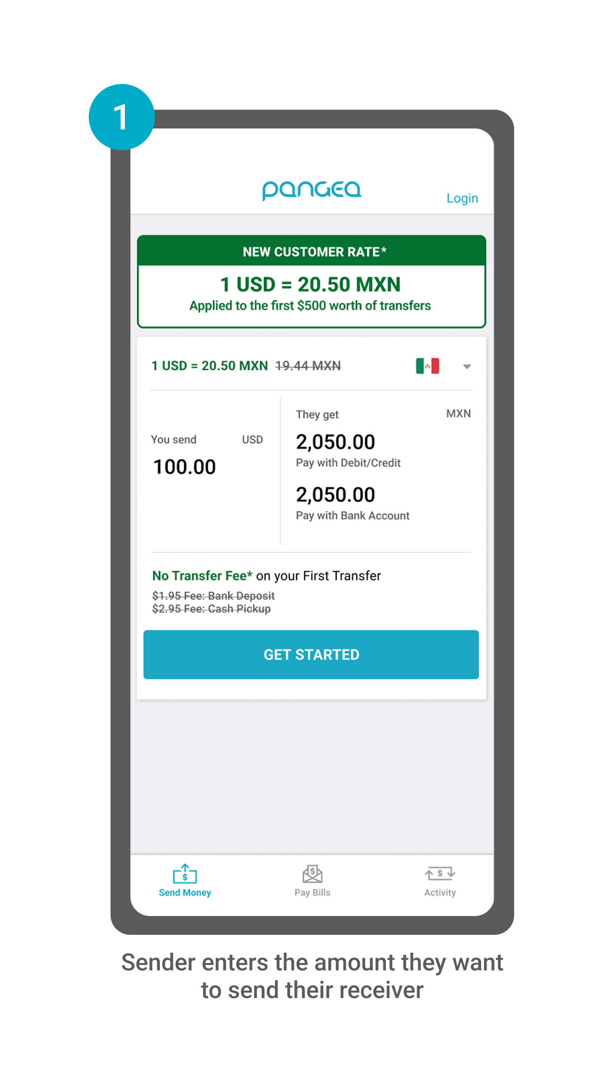
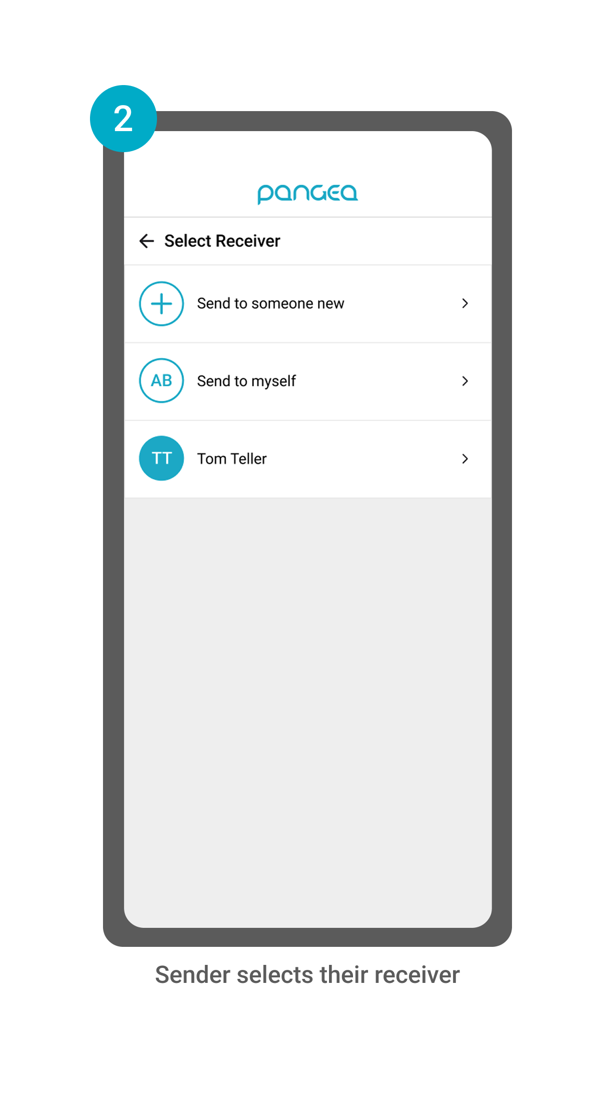
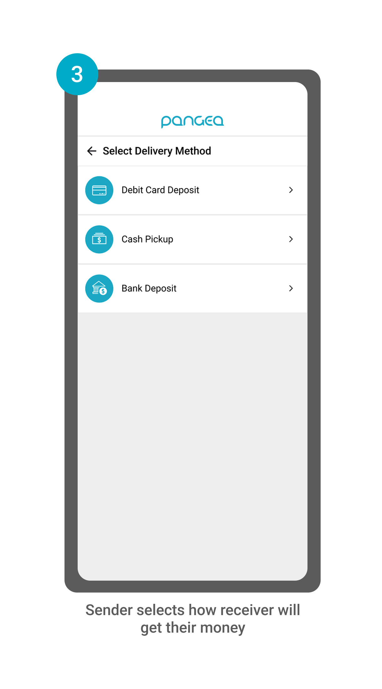
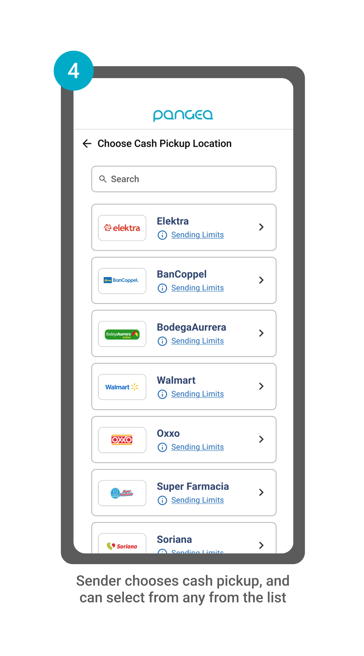
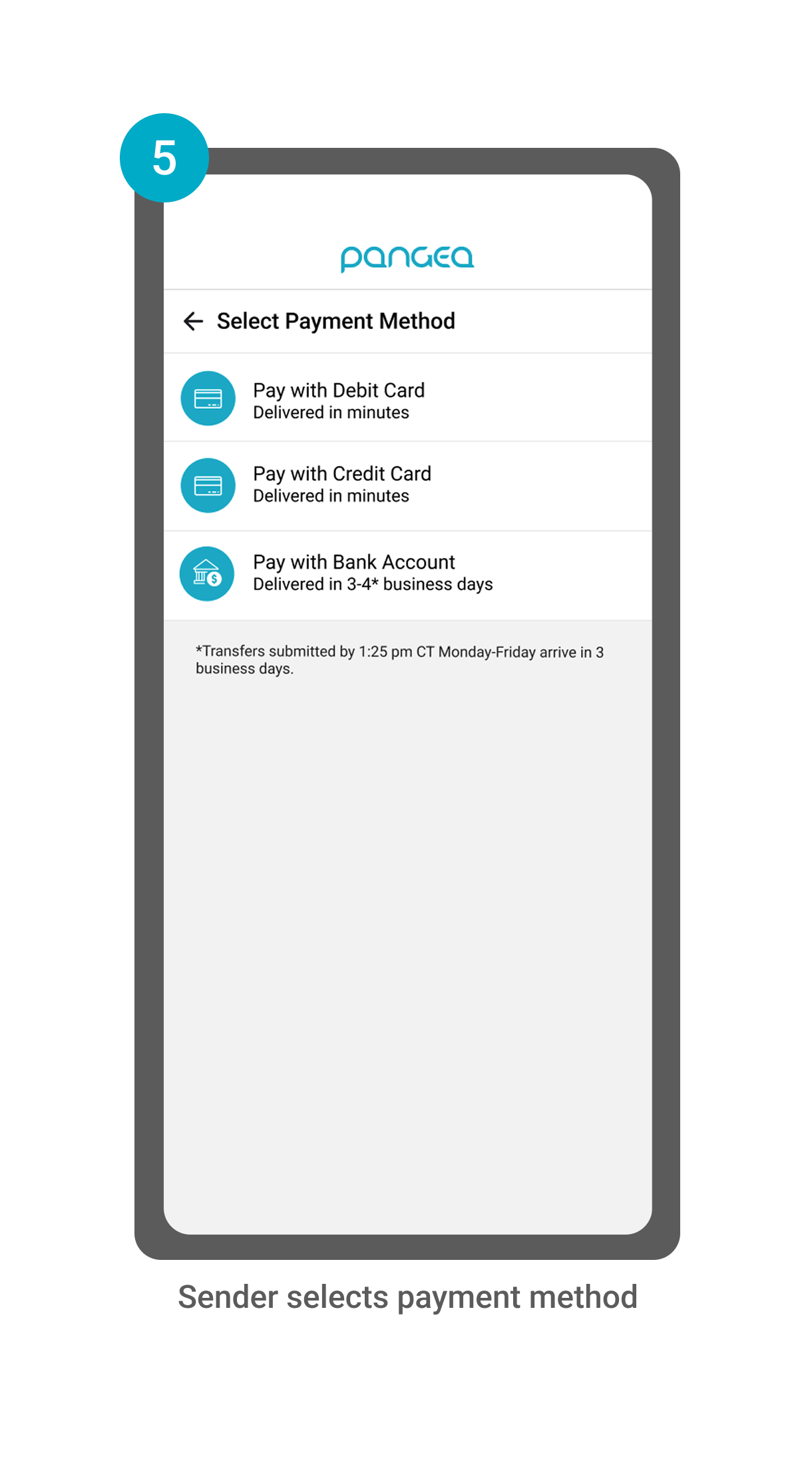
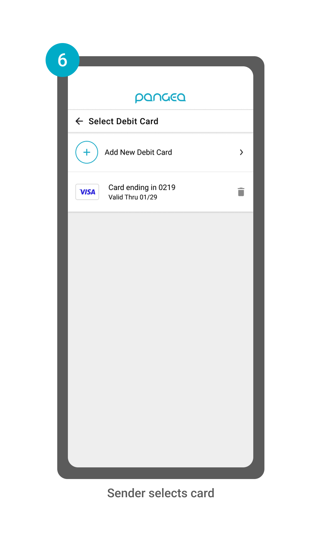
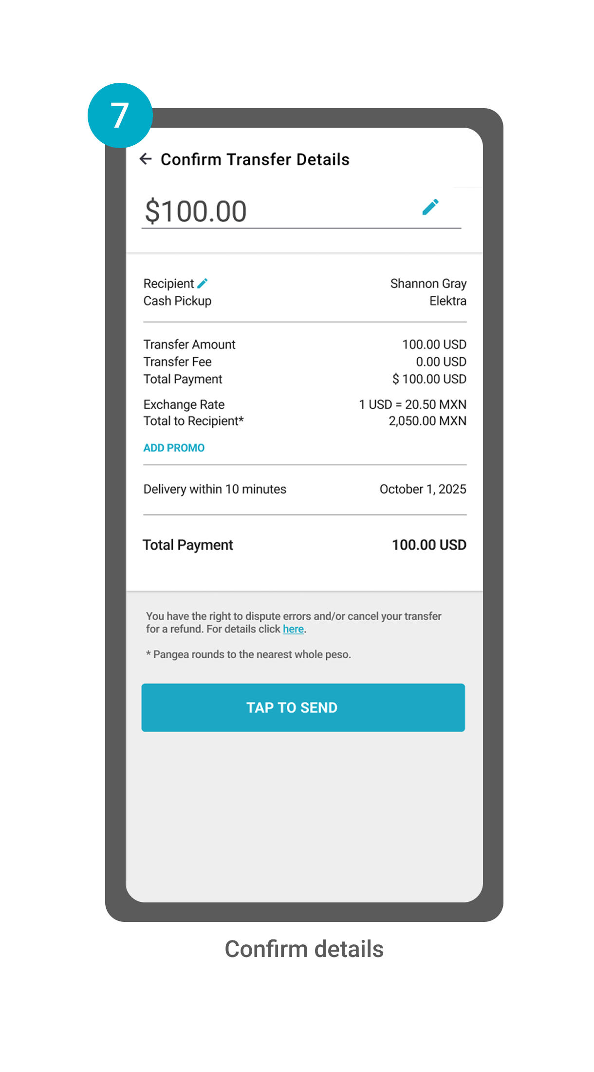
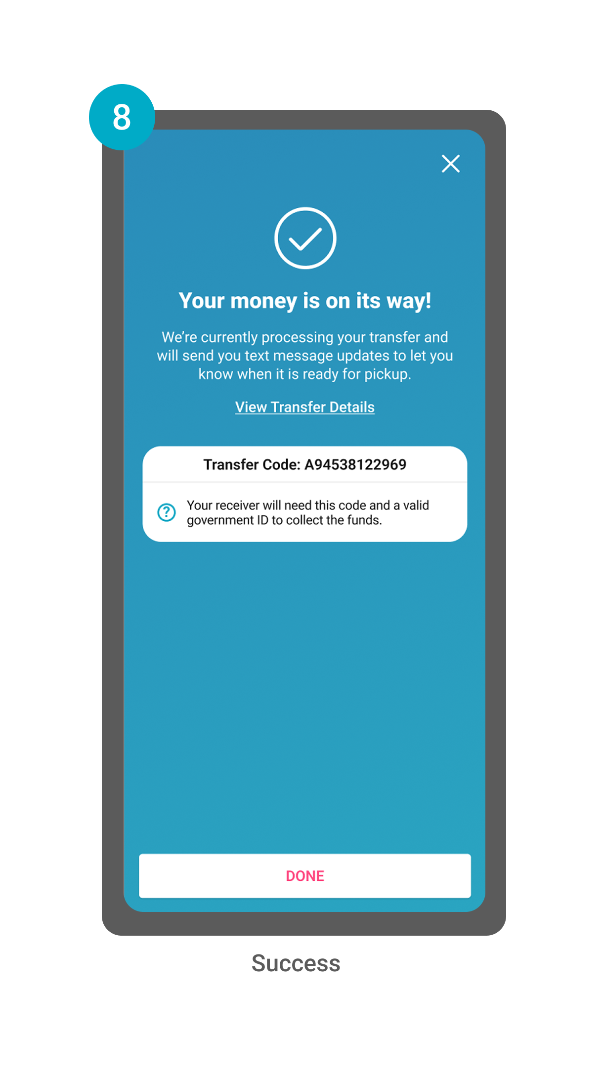
Current Mobile App Flow (8 Screens)
User Personas: Power-Senders, Mexico/Latin American Corridor
Our users are financially confident, digitally engaged and typically send money home 2+ times per month. These users have strong ties to their home country, primarily in Mexico or Latin America. 67% of our users are male, 42% are U.S. born, and usually send 25% of their income for personal needs and to support loved ones. The three main types of users we cater to are:

The Independent Family Connector
Unmarried, Supports Parents & Relatives Abroad

The Hardworking Family Anchor
Married, Supports Spouse & Parents Abroad

The Steady Family Supporter
Lives with Spouse, Supports Parents & Relatives Abroad
Power-Sender User Feedback
“Is there a way I can categorize my transfer? I’d like to know the reason I’m sending when I look back at my history.”
“Is there a better way for me to keep track of how much I’ve sent this month?”
“I don’t always remember who I’m sending to and how much I’ve sent- it’s tricky to figure it out in the [Pangea] app, so I usually do my tracking on a separate spreadsheet.”
Common feedback from Power-Senders was
1) They want to categorize their transfers to better understand why they send,
2) They want a better way to keep track of their sending in-app (many users would track their transfers separately through spreadsheets, WhatsApp chats with family, or in a notepad.)
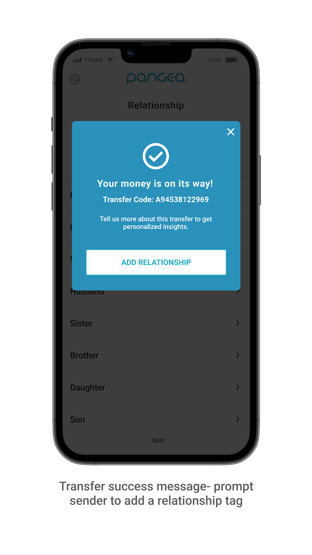
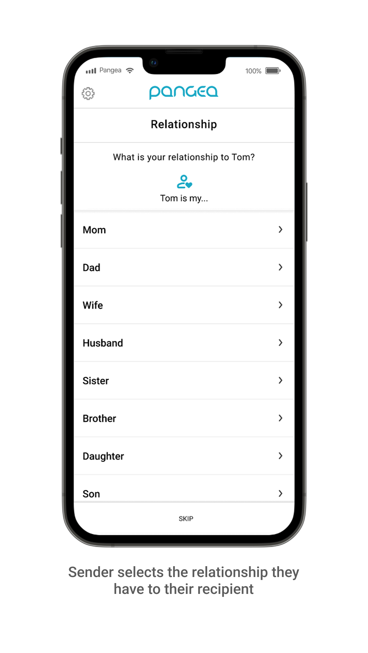
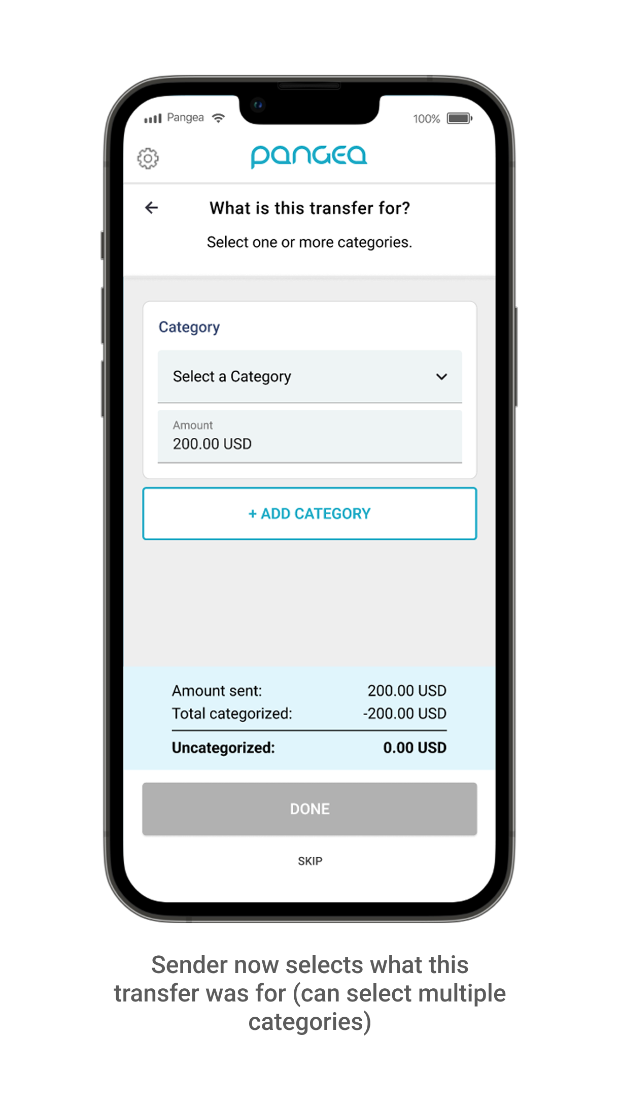
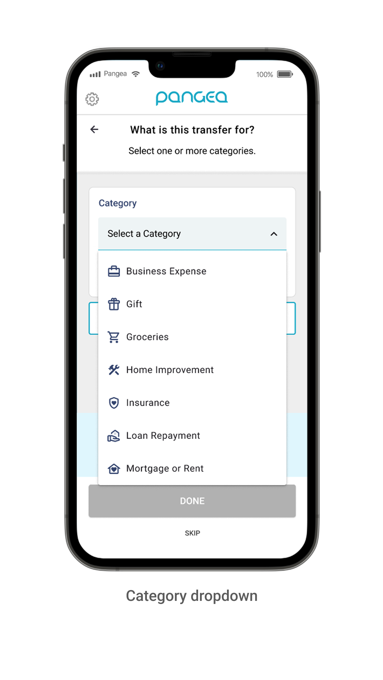
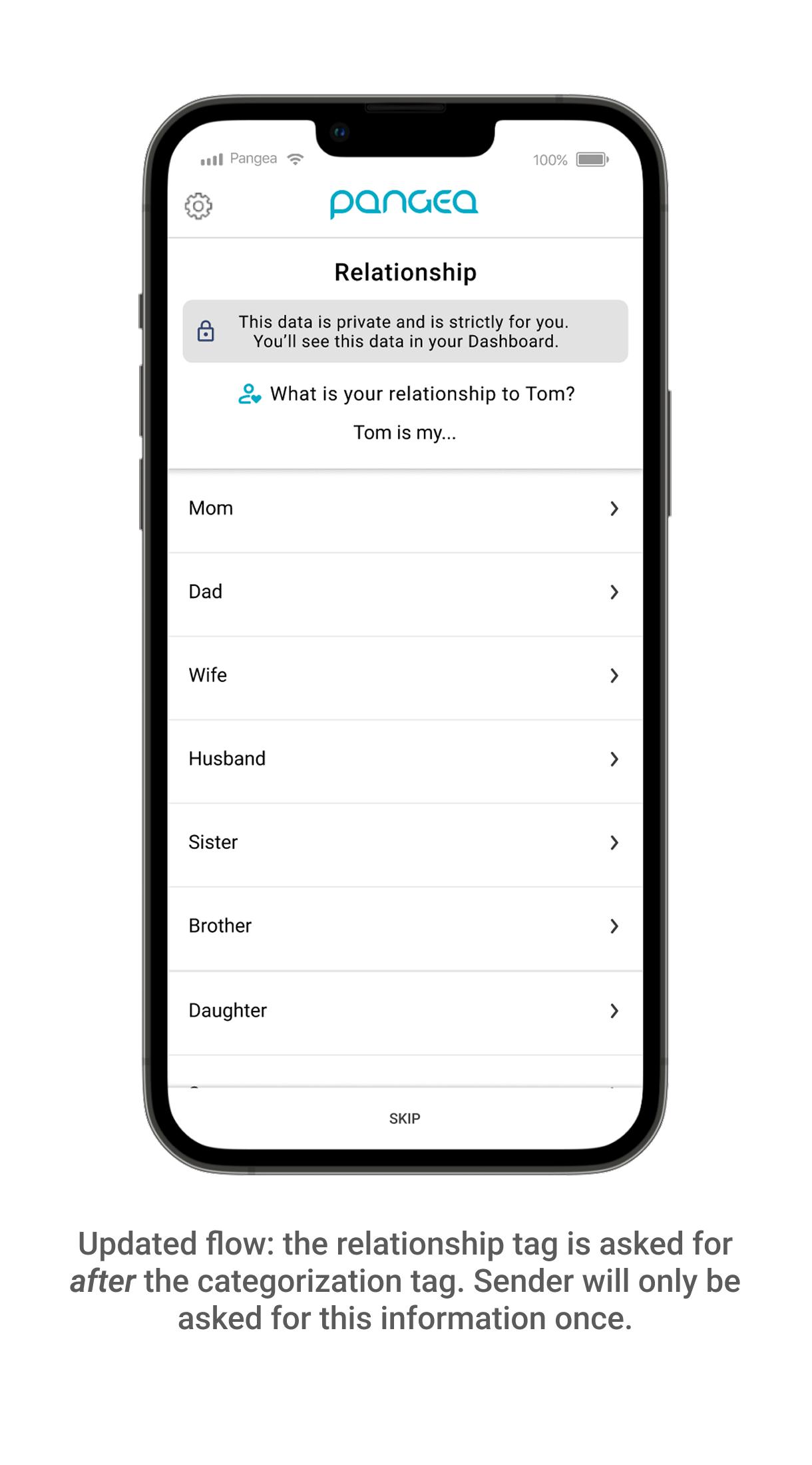
Asking for senders to “tag” their transfers (add a category and relationship tag) allowed Pangea to give them more transparency, control, and awareness of their sending habits.
New Proposed Workflow
Ideation and Sketches
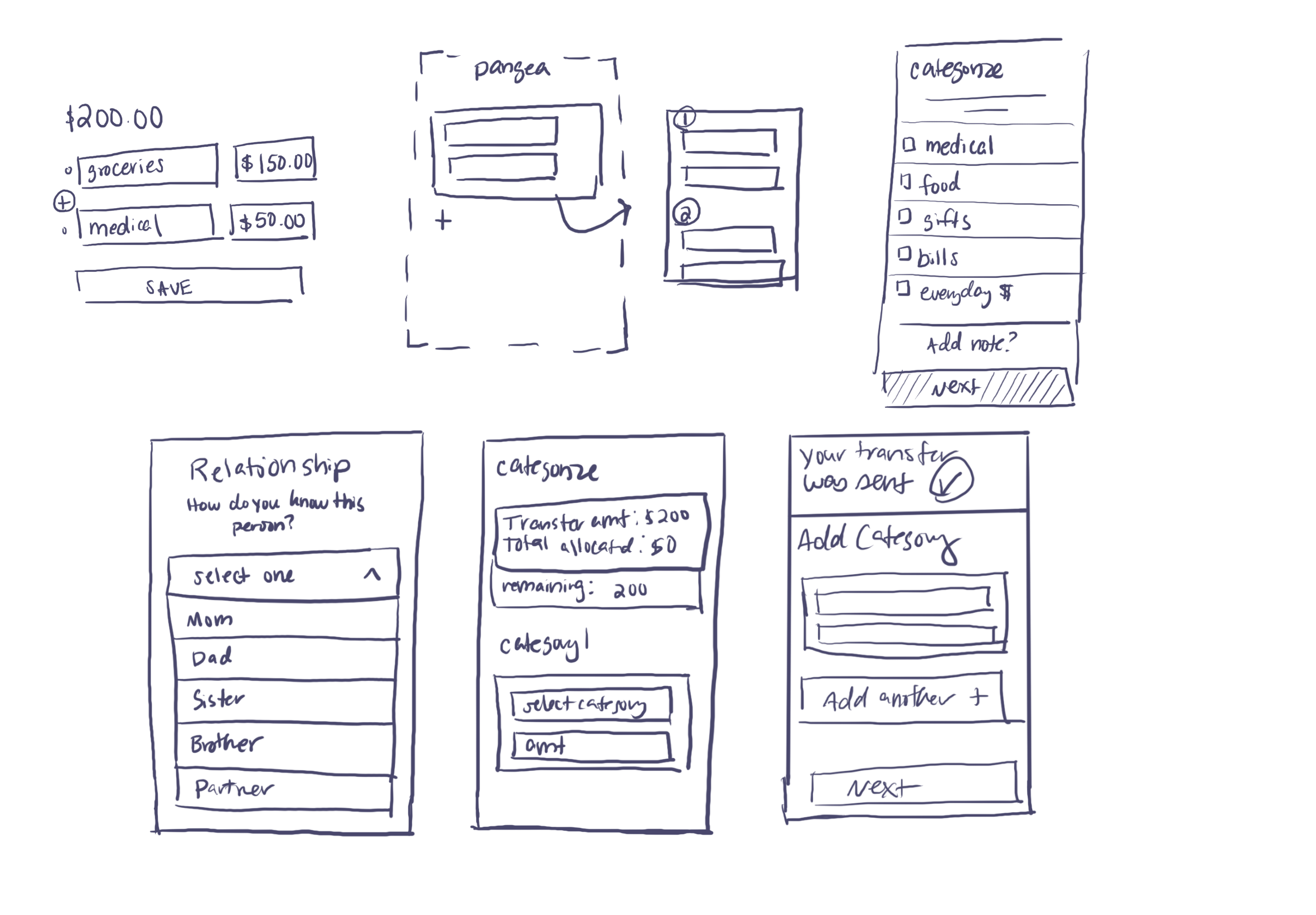
Discovery Sketches
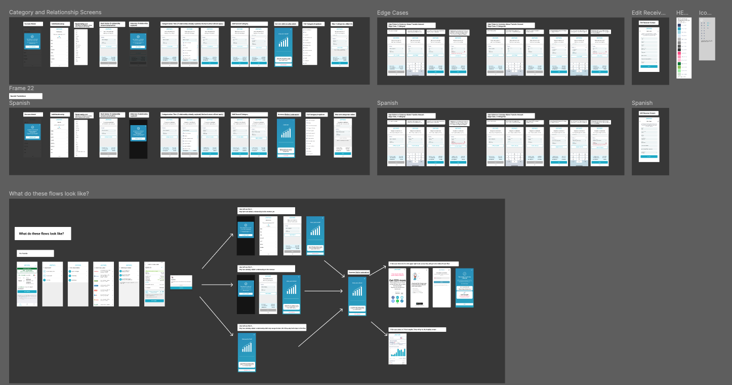
Digital Mocks
I collaborated with product mangers, engineers and marketing to scope out our experience.
Design Spotlight: Initial Design Flow
The screens below were the initial designs that we A/B tested in our app with 50% of our Mexico/Latin American audience.
Note: Mocks were designed in English and Spanish to accommodate our user base.
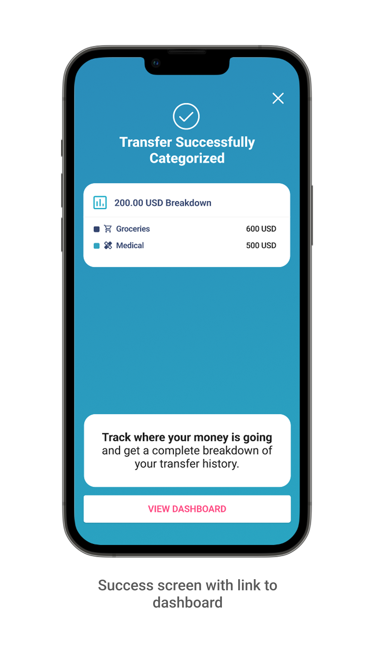
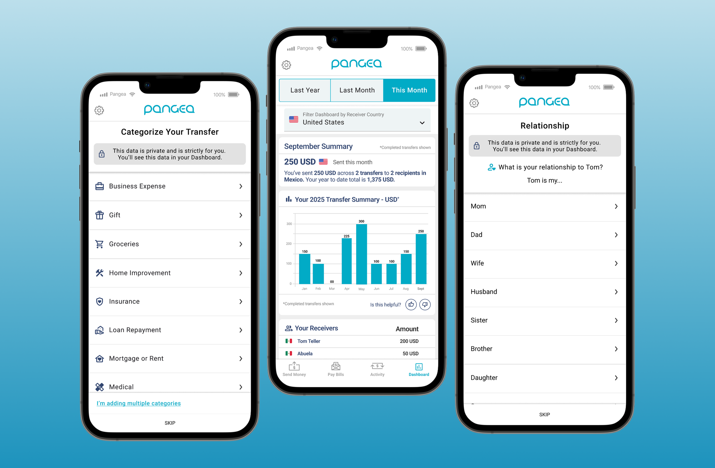
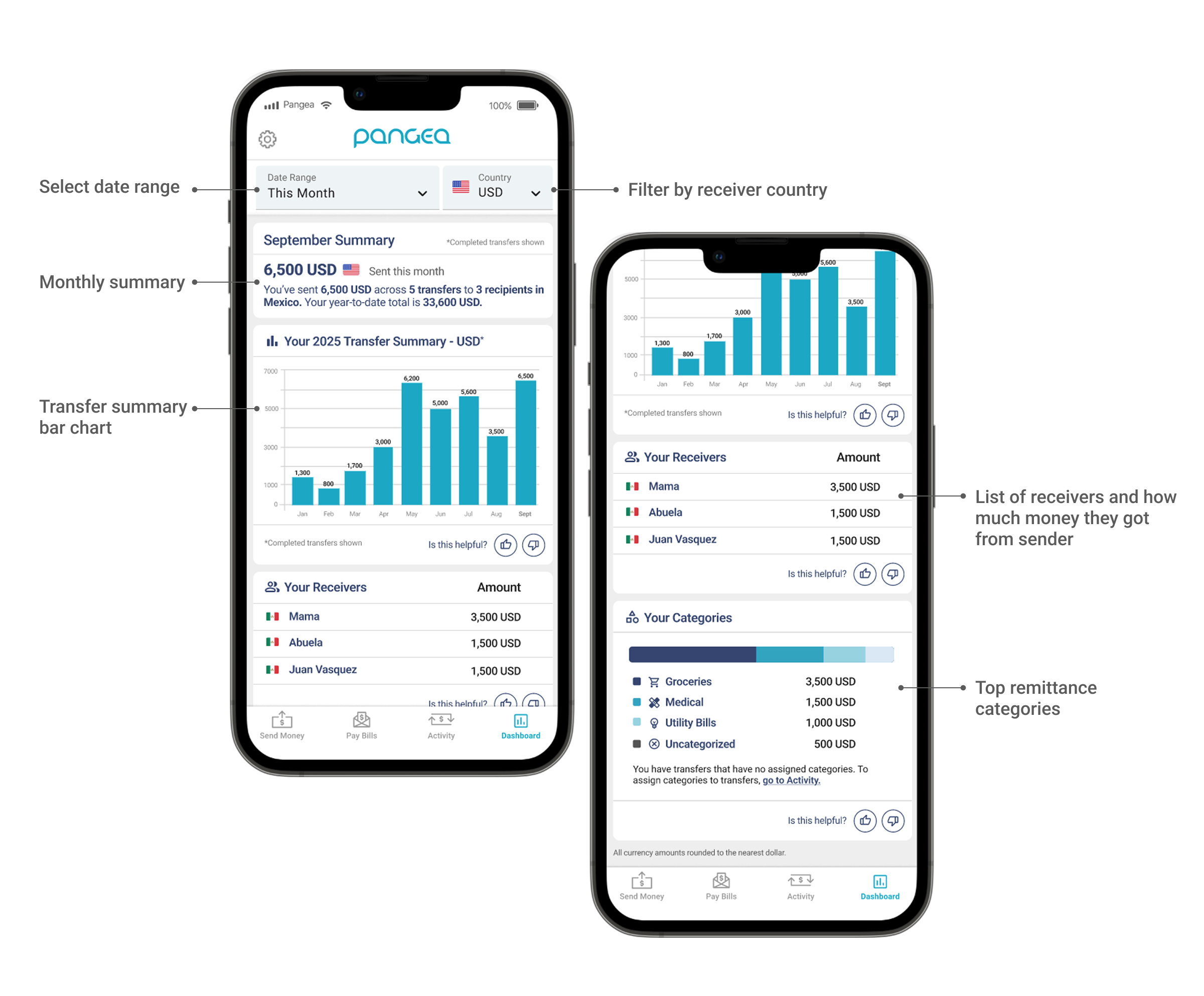
Design Spotlight: Initial Insight Dashboard Designs
Initial User Feedback
Our feedback buttons in our dashboard registered that ~87% of users who interacted with the dashboard found the information displayed to be very helpful. 40% of English speakers were adopting the post-transfer workflow, but Spanish speakers had a noticeably lower adoption, with only 20% tagging their transfers. We initiated user interviews with our Spanish-speaking users to better understand why they weren’t adding in their information. Below is some of the feedback we heard:
”How is this information being used? Is my information safe?”
Due to increased deportation efforts in the United States, many of our users were hesitant to enter information about their relationships and reasons for sending. They didn’t fully understand how this information would be used. Some expressed they were worried that this information would be shared with government agencies, and some felt that the relationship tag would put their families at potential risk.
”I’m a little confused… am I about to send another transfer?”
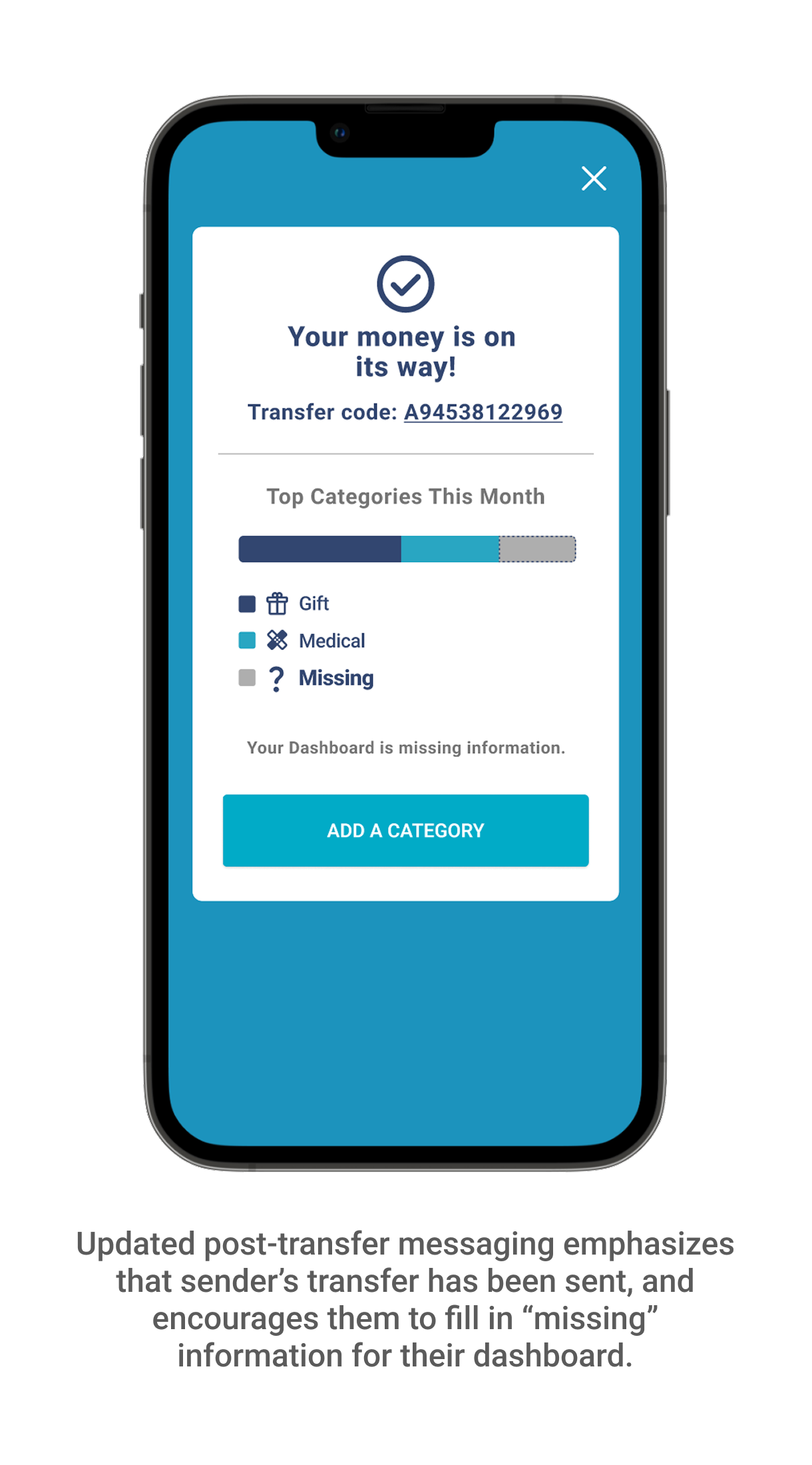
A few users expressed concerns that some of the screens in the post-transfer flow looked like they were entering in information to send another transfer. Some thought that they hadn’t sent their initial transfer, causing confusion.
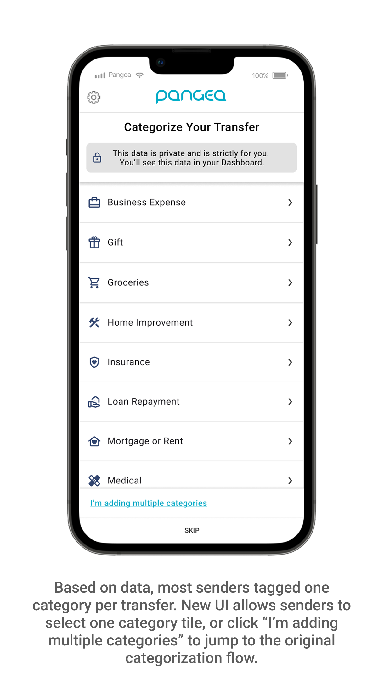
“Adding a category feels like doing homework… I’m really only sending for one reason and this was taking too long”.
We hypothesized that our users may want to tag multiple categories for each transfer, but looking at our initial data, most of our users only tagged one category. The current UX was being perceived as tedious and some users just clicked “skip” to move on.
UI/UX Next Steps
Once we walked users through the flow, they better understood the value of entering their information, and were excited about the dashboard. With these pieces of feedback in mind, we started a new phase of design to
-Increase feelings of security; make it known that this information is strictly for the sender and their dashboard.
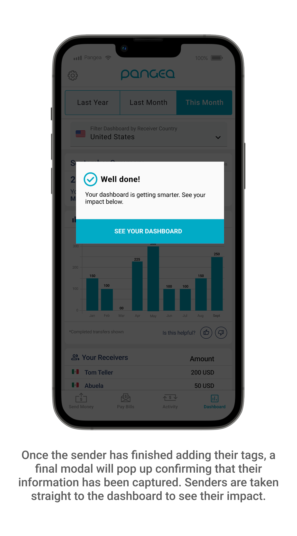
-Emphasize that the sender’s transfer is in progress/has been sent; we needed to make it clearer to senders that their transfer was on it’s way, and better communicate that the post-transfer flow had a separate goal of helping them better understand their habits.
-Simplify the categorization process; by making it less tedious to tag their category and relationship, there would be a greater likelihood that users would adopt the feature.
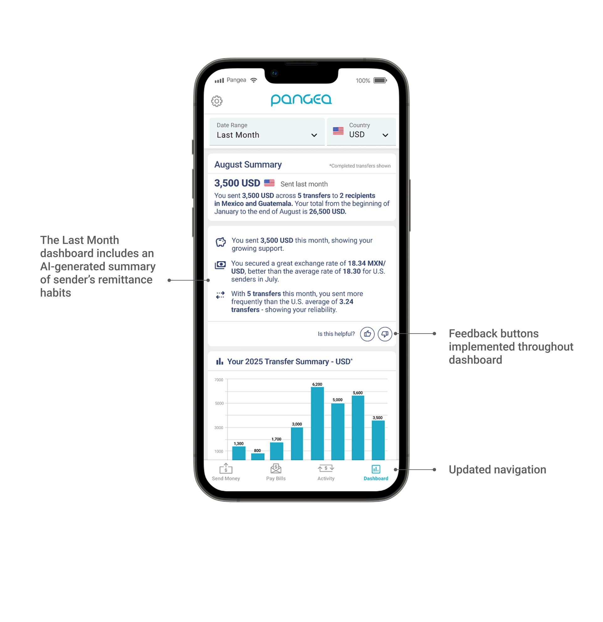
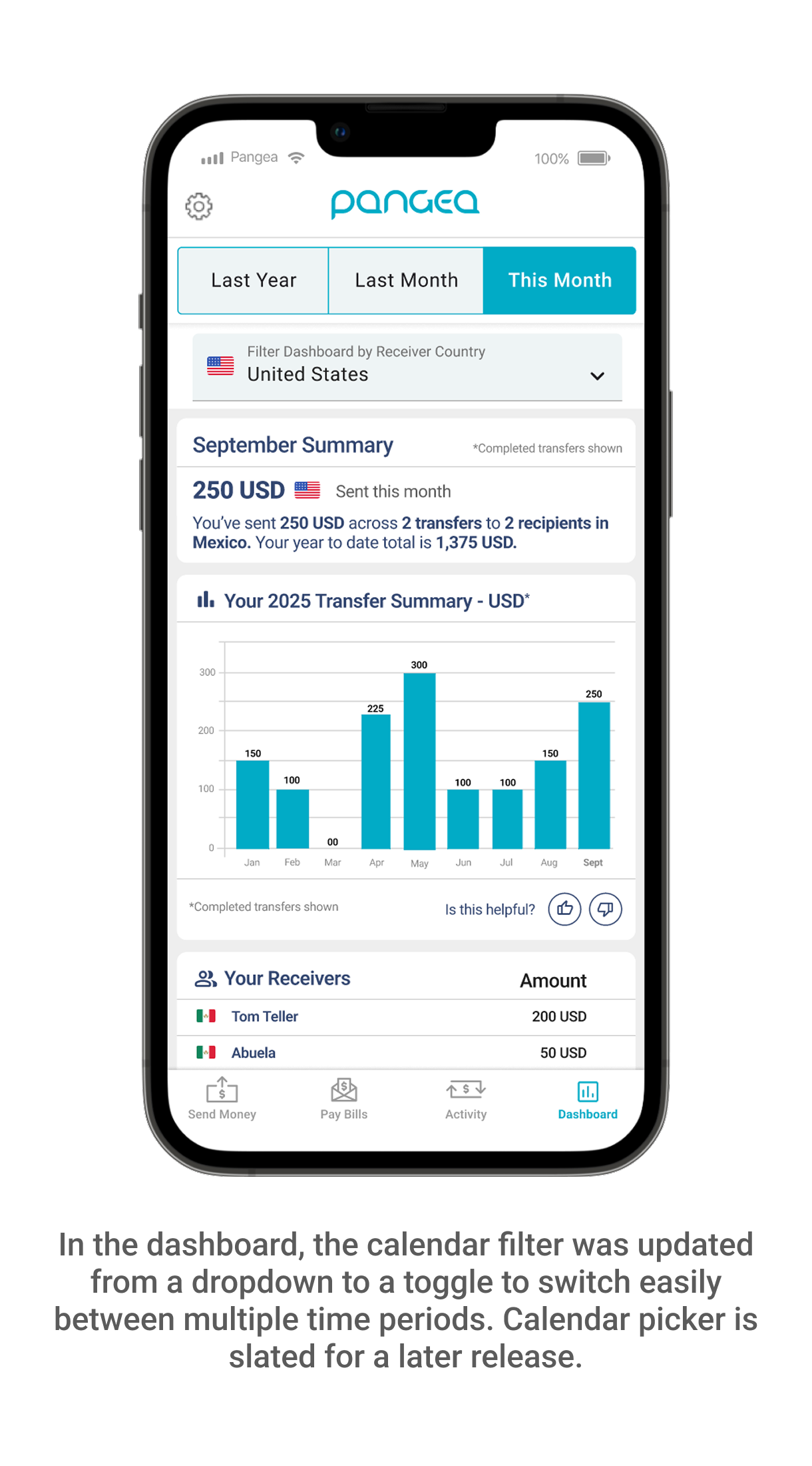
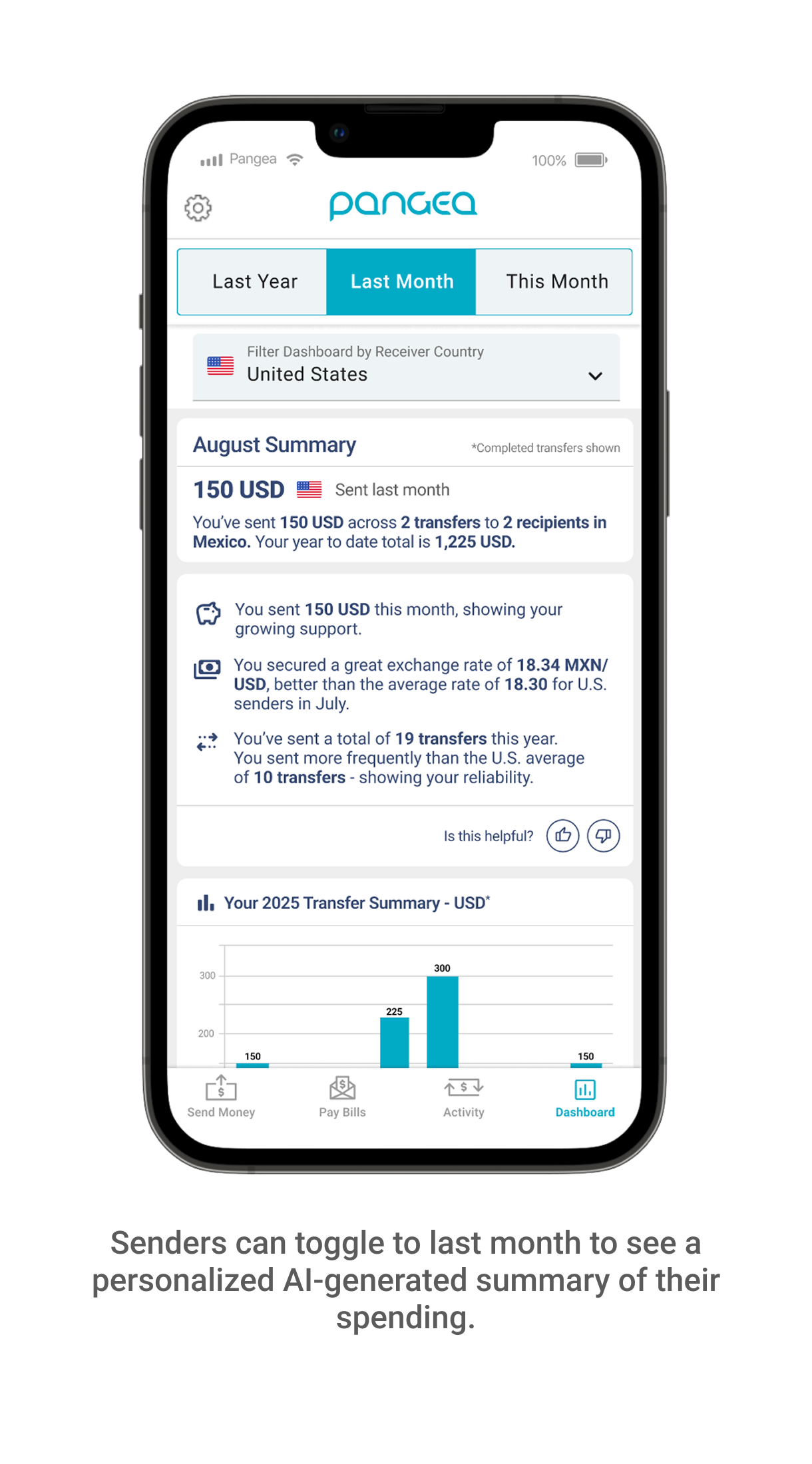
Another small adjustment was to swap the dropdown date selector in the dashboard and opt for a toggle treatment instead. We had AI-generated insights being displayed in the “Last Month” time period that was being missed by a large percentage of our audience.
Final Designs
Updated Design Flow Feedback
After making UX/UI changes, we conducted follow-up interviews with our Spanish-speaking users who were immediately more comfortable and excited by the feature. They understood the value of tagging their transfers, felt more secure adding their information, and were excited to see the impact shown by their dashboard. We have also seen users actively use the toggle functionality in the dashboard to explore more of their summary insights.
“Wow, I didn’t realize how much money I’ve sent this year to my family! This is so helpful.”
“It’s been great to see that I’ve contributed a lot to my parent’s medical bills. It makes me feel good knowing I’ve been able to help them.”
“It’s nice that I can visualize how much I’ve sent. I’d mainly track my sending in WhatsApp chats, but this is much easier.”
Feature usage data is currently being collected, with activity trending upwards.
Team: Product Leads: Joel Binder and Harish Krishnan; Director of Product: Nishith Patel; Front-End Developer: David Maslowski; Lead Data Engineer: Syed Ali