
Client: Pangea Money Transfer Year: 2024-2025 Role: UX Research, Wireframing, Prototyping, UX+UI Design Team: Product Leads: Joel Binder and Harish Krishnan; Director of Product: Nishith Patel; Front-End Developer: Abner Rojas
Background: Pangea Money Transfer allows customers to send money back home, wherever they are. The focus is creating simple, effective experiences to make the money sending process (also known as remittances,) seamless.
Problems
Pangea had a bit of an identity problem, and it was causing more than a few issues.
With no UX or UI designer previously at the company, the Pangea app and website looked like completely different entities. Amongst iOS, Android and web environments, there were 3 different visual patterns being implemented, which was causing confusion for our users and made it hard to tailor a brand identity. App activation rates were slowly creeping up, and retention rates were stale.
It was time for a UI refresh
It was time to make necessary updates to align with our existing user base. The main exchange rate calculator needed to be updated to fit our user needs, and help send money as quickly as possible.
Different devices, different UI
Depending on the user’s device, Pange’s UI would differ significantly in terms of color, supplemental copy treatment, and functionality. This not only made things tricky for the brand identity, but it was more difficult for internal teams to align on design patterns.
“At first, I thought Pangea was a scam”.
Yup, that was a user quote. The lack of cohesion in the foundational experience was making it difficult to trust Pangea, especially with inconsistent visual elements carried throughout everything. An overhaul was necessary.
Solutions
-Align Pangea’s UI across all devices
-Create a cohesive foundational UX experience
-Prevent brand identity confusion
-Make the flow from website to app seamless
-Refresh the UI to differentiate from competitors
-Make it look refreshed and clean
-Align color palette to the name “Pangea”
-Enhance the value proposition of our apps
-Create smarter insight dashboards for users to understand how much they are sending
-Allow users to categorize their transfers to better understand/remember where their money is going
-Encourage users to continue sending to their loved ones to increase app retention
Business Needs
During requirements gathering, we got a good idea of the direction we needed to go from our business stakeholders.
“I’d love to see a visual refresh with more color. Our app looks so boring right now, and it looks so different from one device to another that we are confusing our users.”
“How do we increase the value of this app to our users? How can we make it easier for them to understand how much money they are sending, and how can we encourage them to send more?”
Before: Cluttered screens, non-accessible font and type treatments, and difficulty to know what’s clickable and what isn’t.
“Our app needs work, but we need to simplify and enhance the visuals on our website. It’s in dire need of a refresh and is usually one of the first touchpoints for users before downloading our app.”
Before: Though there are some colors being borrowed, the iconography, concept and brand voice is not being carried through the website.
Research and Exploration
Personas
Our users are financially confident, digitally engaged and typically send money home 2+ times per month. These users have strong ties to their home country, primarily in Mexico or Latin America. 67% of our users are male, 42% are U.S. born, and usually sends a significant portion of income for personal needs and to support loved ones. The three main types of users we cater to are:

The Independent Family Connector
Unmarried, Supports Parents & Relatives Abroad

The Hardworking Family Anchor
Married, Supports Spouse & Parents Abroad

The Steady Family Supporter
Lives with Spouse, Supports Parents & Relatives Abroad
User Feedback
Users had their own feedback about what they wanted to see in the app to make things easier for them to send transfers.
“Is there a way I can categorize my transfer? It can be a note or a dropdown- I’d just like to know the reason I’m sending when I look back at my history.”
“I want to know the current exchange rate as quickly as possible when I open the app, and I’d like an improved activity log so I can more easily check the status of my transfer.”
“Is there a way that I can better understand how much I’ve sent in the past month or the past year? I go to my activity log but I’d like to be able to more actively track my sending habits.”
UI Focus
Clean, accessible components
Rounded, soft edges
Using lighter tints of brand colors, utilize more color usage throughout app to tie into the brand concept of “Pangea”.
App Visual Refresh
After user testing multiple iterations of interface designs, we opted for a softer, more blue/green color scheme to mirror the name “Pangea”.
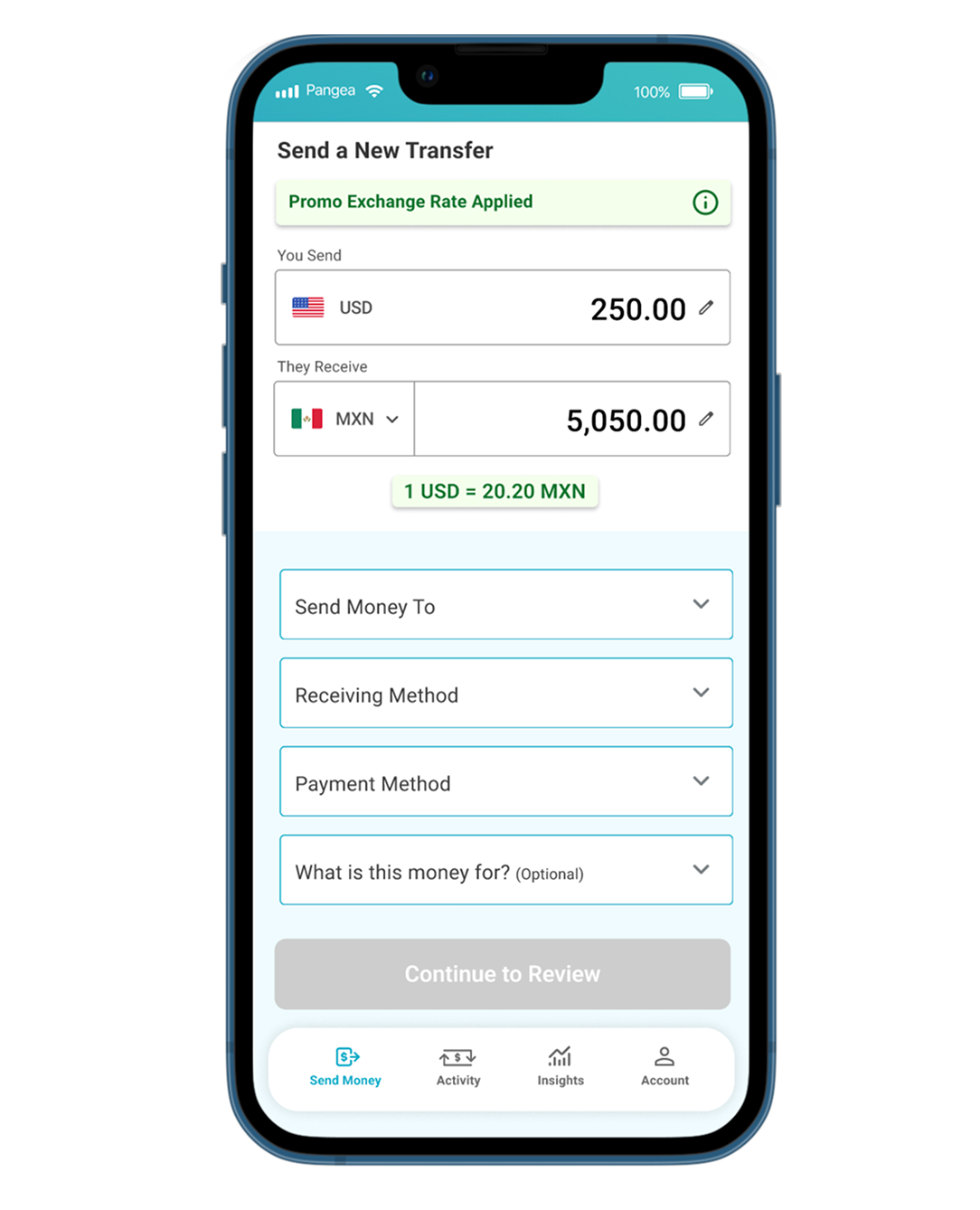
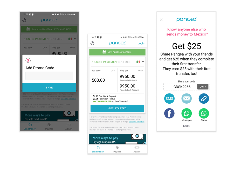
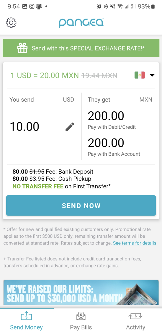
Send Money Easier Than Before
By combining all elements onto one screen, users can opt to make quick changes without having to navigate through/get stuck in a large transfer flow. Promotions and exchange rates are displayed clearly, with less overwhelming informational clutter.

Financial Insights
This insights screen allows for users to see how much they’ve sent, who got the most money, and shows a breakdown of categorization transfers. These details give users a better picture of their spending, and let’s them do less math.
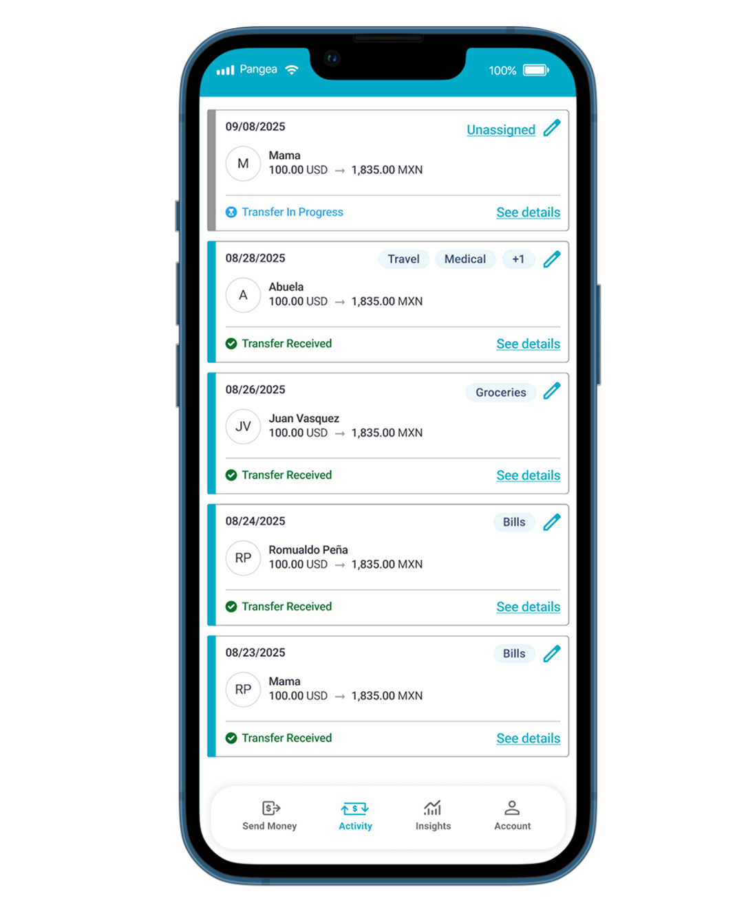
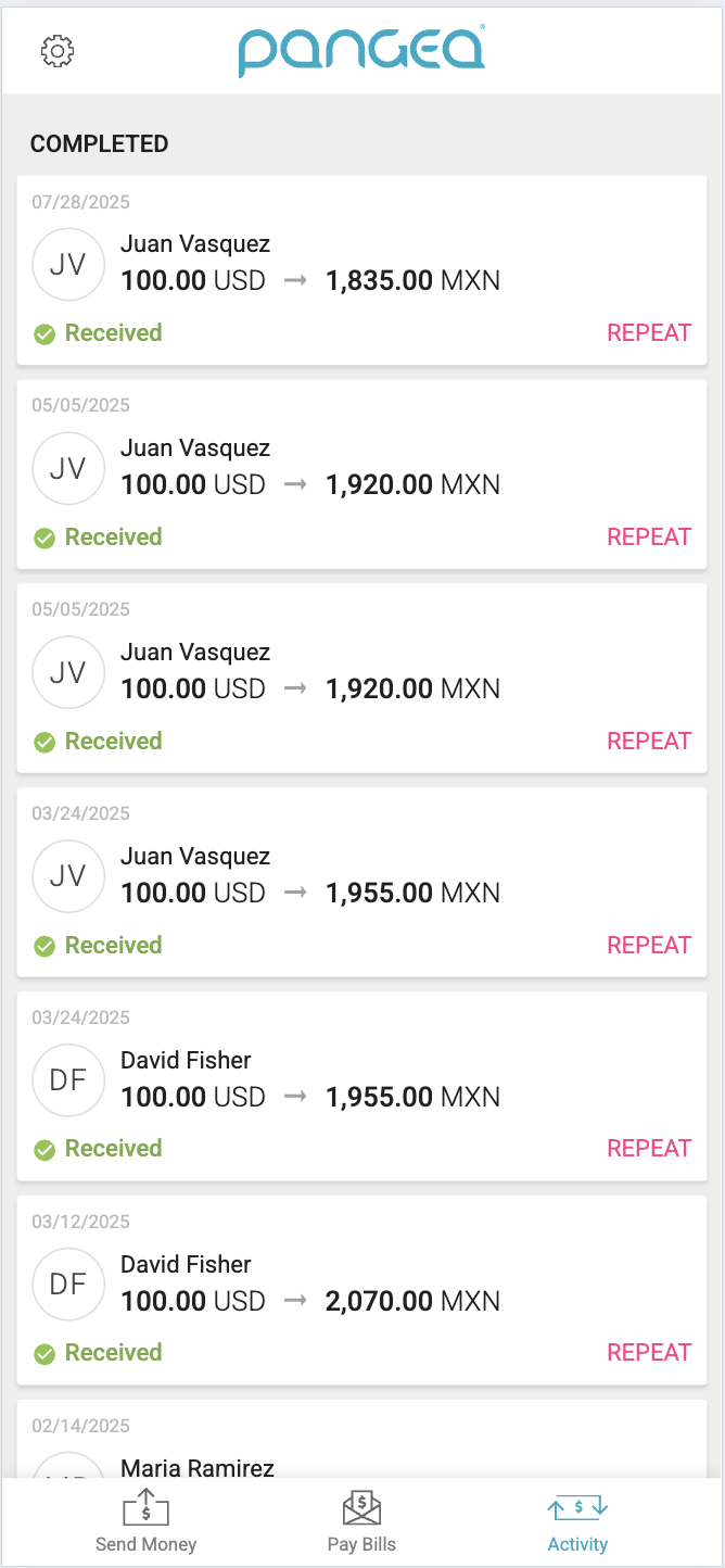
Activity That You Can Track
Users can now click into details, see the status of all their historical and current transfers, and can show categories/can categorize on the spot.
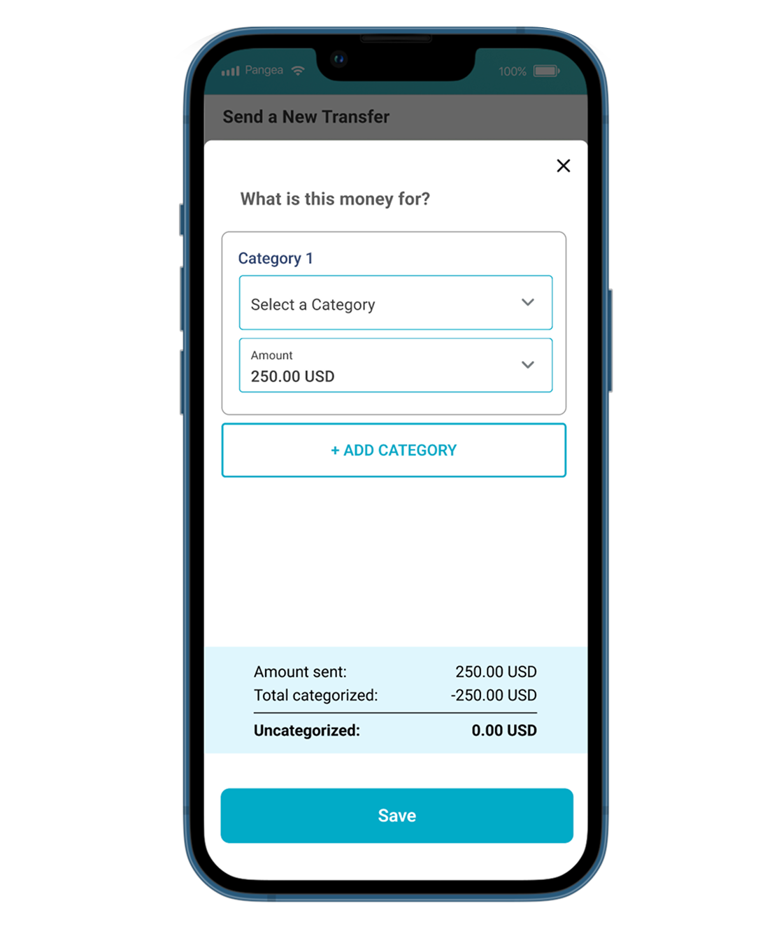
Categorize Your Spending
Users can categorize their transfers (and add more than one category) to better get insights into their spending habits.
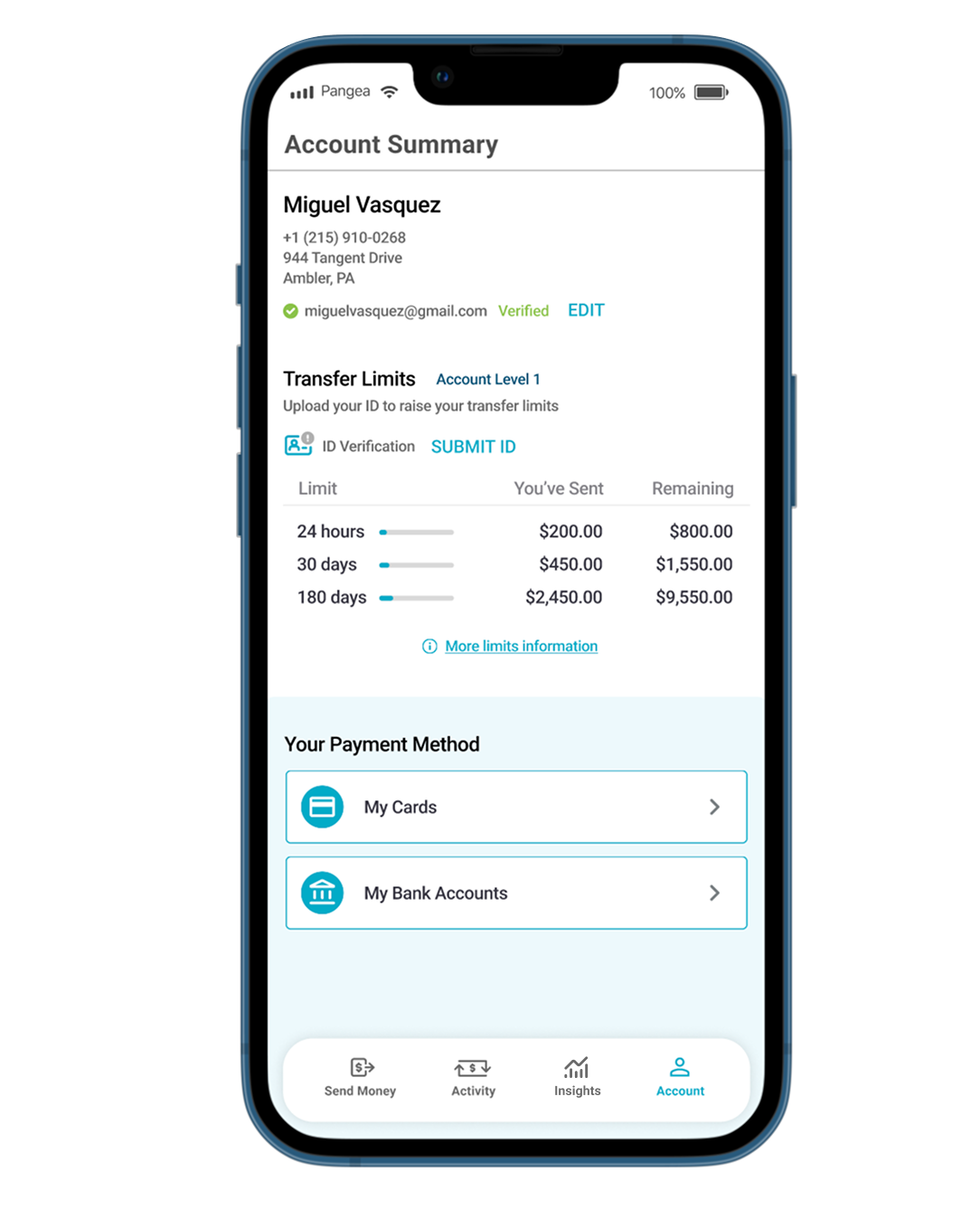
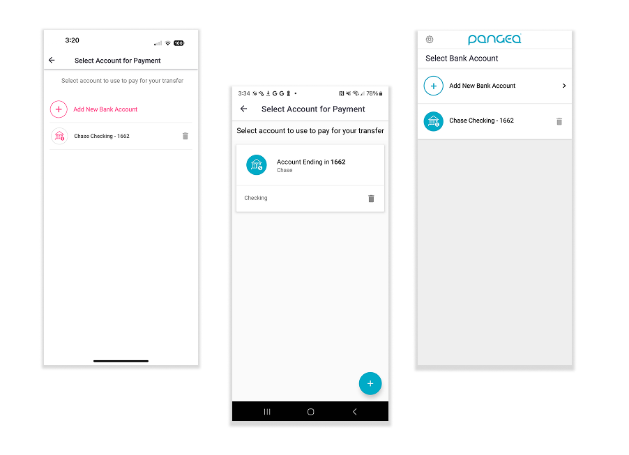
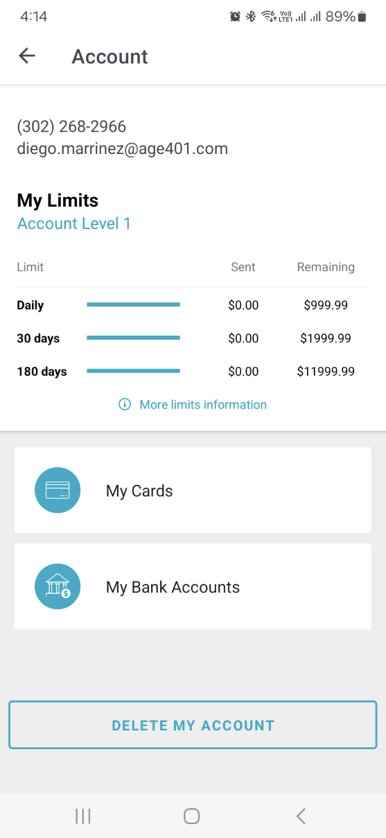
Accessible Account Details
Users now have access to their payment methods, transfer limits, and more important details
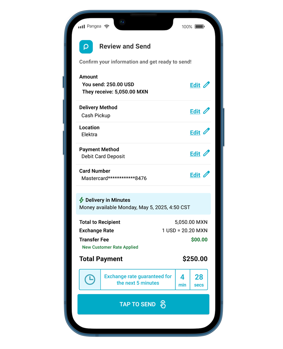
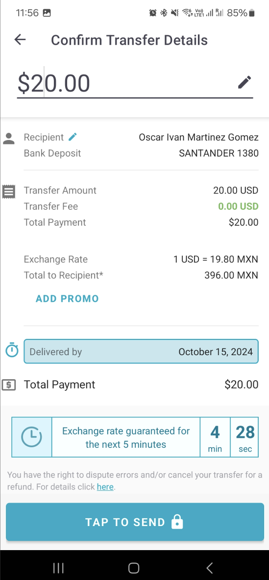
A Clearer Confirm Screen
Easy to read confirmation screen with the ability to go back and edit anything you need. Promotional rates, delivery times, and selected details are easier to see (and our users agree!)
Main Send Money Flow
User Feedback on the App Changes
“WOW, I love that everything I need to set up before sending is on the same page. That’s so much simpler.”
“I love being able to categorize my transfers, and I love how much brighter everything is. It feels new but still the same.”
“I love being able to see how much money I’ve sent to my family. I feel like keeping track of my sending will be so much easier with this!”
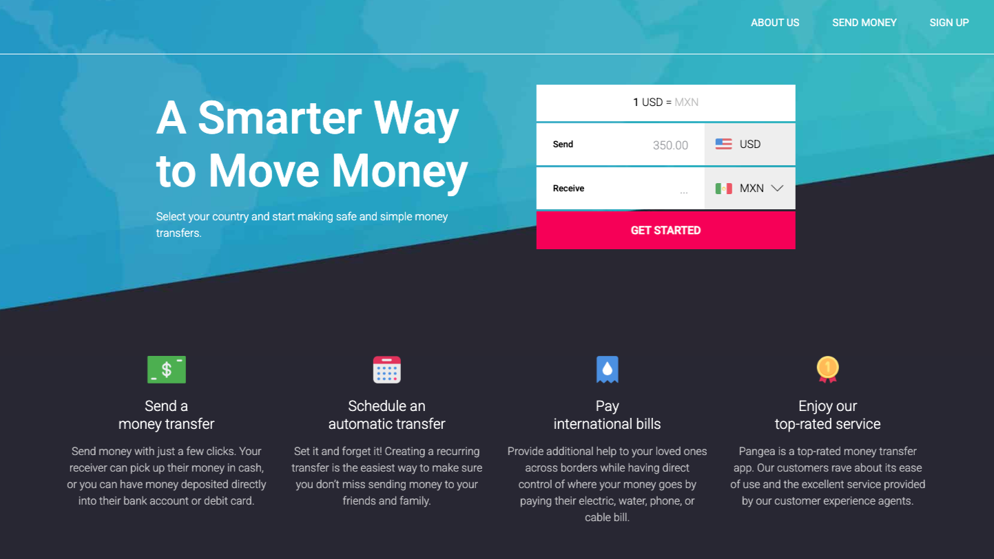
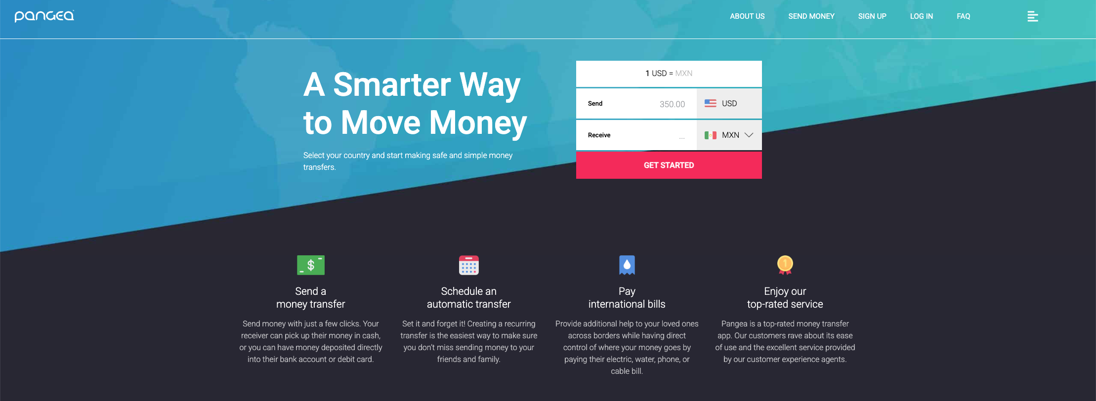
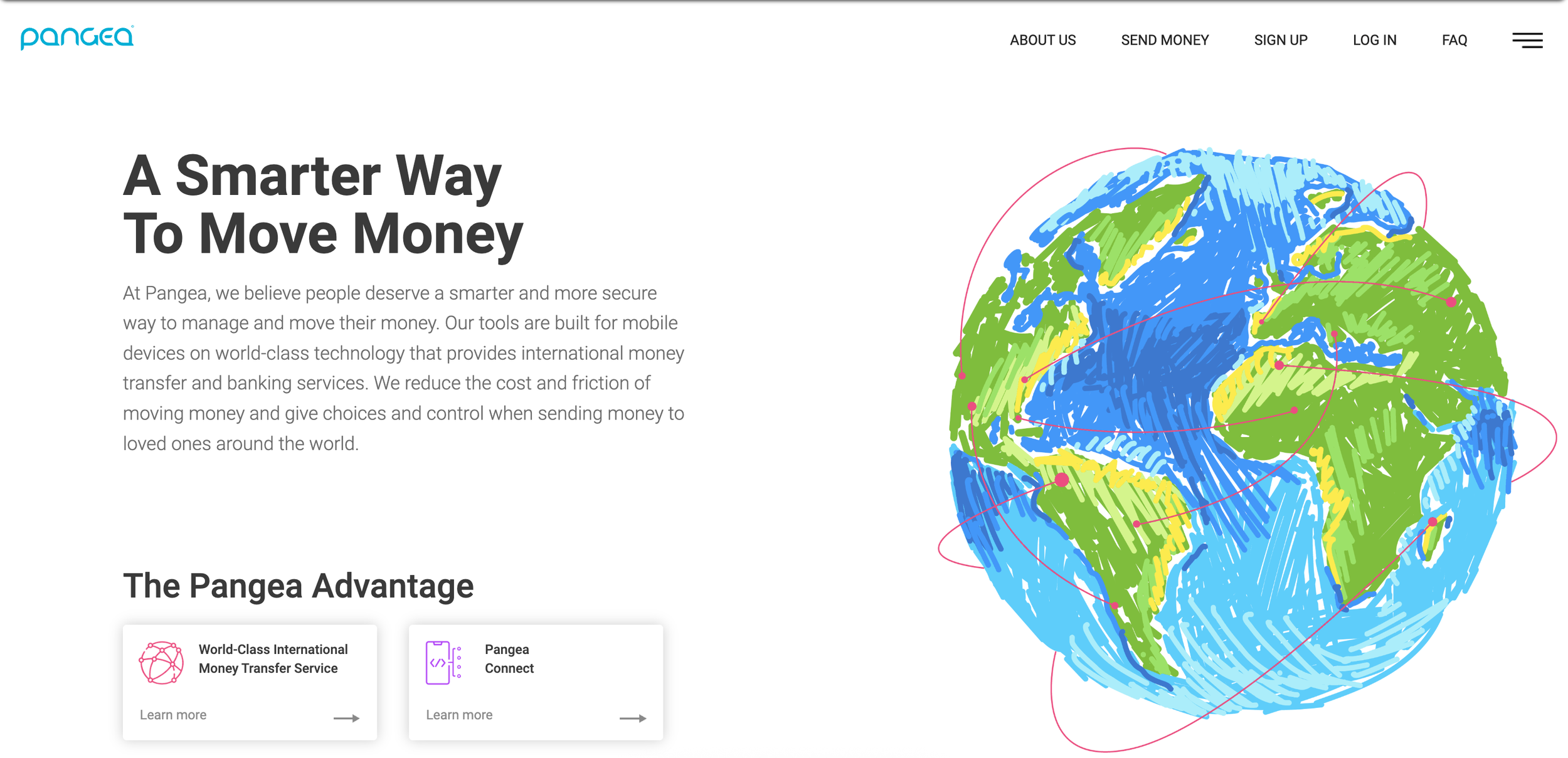
Website Updates
The website updates were a great chance for us to better showcase our colors, what countries users can send to, and give a better idea of how to send quickly and easily.